Ever opened a prescription bottle and stared at the label like it was written in code? You’re not alone. Millions of people struggle to understand what’s on their pharmacy labels - especially when fonts are tiny, warnings blend into the background, or instructions use medical jargon. But these labels aren’t just random printouts. They’re carefully designed tools meant to keep you safe. And right now, they’re changing - fast.
What’s Actually on Your Prescription Label?
Your prescription label has to include a few basic things by law: your name, the drug name, the dosage, how often to take it, and the prescriber’s name. But that’s just the start. Many labels now include expiration dates, refill instructions, and barcodes. What you might not see is the hidden structure behind those words.Since 2012, the United States Pharmacopeia (USP) has pushed for standardized label design. Their goal? Make it easier for anyone - no matter their age, education, or vision - to understand what to do. That means using sans-serif fonts like Arial or Helvetica, with at least 6-point type for basic info and 8-point or bigger for warnings. Backgrounds must contrast sharply with text. No light gray on white. No fancy script. Just clear, bold, easy-to-read letters.
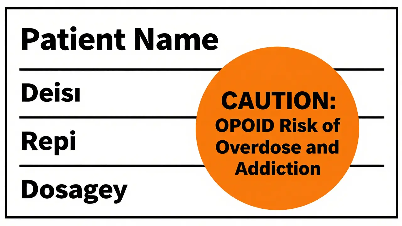
And then there are the warning stickers. These aren’t just decorative. In Connecticut, since January 1, 2024, every opioid prescription must have a fluorescent orange, 1¼-inch diameter sticker. It’s not optional. It’s the law. The sticker says: CAUTION: OPIOID Risk of Overdose and Addiction. The color? Chosen because it stands out even to people with fading eyesight. The size? Measured exactly so pharmacy machines can detect it during automated checks.
Why Do These Labels Look So Different Across Pharmacies?
You might notice that your label from CVS looks nothing like the one from your local independent pharmacy. That’s because, until recently, there was no national standard. The FDA only requires the bare minimum: your name and dosage. Everything else? Left up to each state.That’s why you’ll find:
- Some states require bilingual labels - California, for example, mandates Spanish translations for 32% of prescriptions.
- Others demand specific warning colors or shapes - like Connecticut’s orange circle.
- Some pharmacies still use old-school labels with tiny print, while others have switched to digital systems that print clearer, larger text.
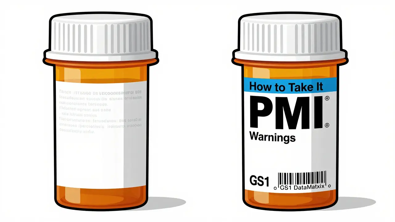
The FDA’s new Patient Medication Information (PMI) rule, expected to be fully in effect by January 1, 2025, will change all that. For the first time, every pharmacy in the U.S. will have to use a single, standardized format. Think of it like a universal recipe card for medications - same layout, same sections, same language, no matter where you pick up your pills.
What Do Those Warning Stickers Really Mean?
Those bright red or orange stickers aren’t there to scare you. They’re there to save you. Each one is tied to a specific risk:- Opioid stickers warn of overdose and addiction risk. These are mandatory in 27 states.
- Black box warnings (often printed directly on the label) signal serious, life-threatening side effects - like liver damage or heart rhythm problems.
- Alcohol interaction stickers tell you not to drink while taking the drug. This is common with antibiotics, antidepressants, and painkillers.
- Driving caution stickers appear on meds that cause drowsiness - think muscle relaxants, sleep aids, or some antihistamines.
But here’s the catch: if you don’t know what to look for, you’ll miss them. A 2023 AARP survey found that 68% of adults over 65 had trouble reading standard labels. Many didn’t even notice the warning stickers because they blended in or were too small.
The new PMI rule fixes this by requiring warnings to be in a dedicated section - bolded, bulleted, and placed right after the dosage instructions. No burying them at the bottom. No hiding them in fine print.
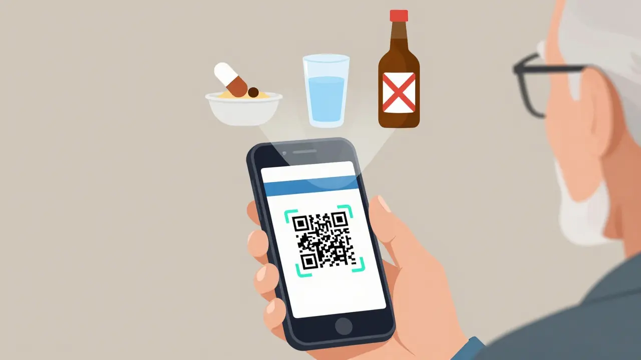
Barcodes and QR Codes: More Than Just Scannable Squares
Every prescription label now has a barcode - usually a GS1 DataMatrix or Code 128. That’s not just for the pharmacy’s inventory. It’s your safety net.When the pharmacist scans your label, the system checks:
- Is this the right drug for your name?
- Is the dose correct?
- Is the expiration date valid?
- Does this interact with your other meds?
That’s called Barcode Medication Administration (BCMA). It’s reduced medication errors by up to 30% in pilot programs, according to the American Association of Colleges of Pharmacy.
Now, some labels are adding QR codes. Scan it with your phone, and you’ll get a short video showing how to take the pill, what to avoid, and what side effects to watch for. It’s still new - only 18% of labels have them as of early 2024 - but it’s growing fast. By 2027, experts predict most labels will include some kind of digital link.
How to Read Your Label Like a Pro
You don’t need a pharmacy degree to understand your label. Here’s how to break it down:- Start with your name. Double-check it’s spelled right. A wrong name means wrong medication.
- Find the drug name. Look for both the brand name (like Lipitor) and the generic (atorvastatin). They’re the same drug.
- Check the dosage. Is it 10 mg? 20 mg? Don’t guess. If it says “take one tablet daily,” that means once a day - not every 4 hours.
- Read the directions. “Take with food” means don’t swallow it on an empty stomach. “Take at bedtime” means right before you sleep.
- Look for warnings. Are there bolded sections? Orange stickers? Black boxes? These are red flags. Don’t ignore them.
- Check the expiration date. If it’s expired, don’t take it. Even if it looks fine.
- Scan the barcode or QR code. If there’s one, use your phone. It might show you a video or a printable sheet.
If anything’s unclear - even a little - ask the pharmacist. Not just “Is this right?” but “Can you explain this part to me?” They’re trained to help.
What’s Changing in 2025 - And Why It Matters
By January 1, 2025, every pharmacy in the U.S. must follow the FDA’s new Patient Medication Information (PMI) format. This isn’t a minor tweak. It’s a full redesign.Here’s what the new label will look like:
- A single-page layout - no flipping back and forth.
- Headings like “What This Medicine Does,” “How to Take It,” “Warnings,” and “What to Avoid.”
- Plain language: no “hypertension” - just “high blood pressure.”
- Warnings in bullet points, not buried paragraphs.
- Font size minimum of 8-point for all critical info.
- Contrast ratios tested for readability by people with low vision.
This change is driven by data. A 2022 report from the Institute for Safe Medication Practices found that 12% of medication errors in pharmacies came from misreading labels - often because names looked too similar or fonts were too small. The PMI rule was built to fix that.
It’s also designed for older adults. Sixty-eight percent of seniors struggle with current labels. By 2030, 1 in 5 Americans will be over 65. If we don’t fix this, the risks will only grow.
What If You Still Don’t Understand?
You’re not supposed to figure this out alone. Pharmacies have resources:- California’s Board of Pharmacy offers free translated label samples in 12 languages.
- The FDA’s docket FDA-2011-D-0694 has downloadable label templates.
- Many pharmacies now offer free 10-minute consultations - just ask.
- Some apps, like Medisafe or MyTherapy, let you scan your label and get reminders and explanations.
If you’re caring for an older parent or someone with low health literacy, don’t assume they understand the label. Sit with them. Read it out loud. Ask them to explain it back to you. If they can’t, it’s not their fault - it’s the label’s.
Bottom Line: Your Label Is a Lifeline
Pharmacy labels aren’t paperwork. They’re your first line of defense against dangerous mistakes. The old system was confusing, inconsistent, and outdated. The new one? It’s being built with real people in mind - not just regulations.By 2025, every label you get will be clearer, bigger, and smarter. But until then, you still need to be the detective. Check the name. Read the warnings. Ask questions. Don’t let small print put your health at risk.
Because when it comes to your meds, understanding the label isn’t optional. It’s essential.
Elizabeth Ganak
December 28, 2025 AT 13:28Finally someone wrote this in plain English. I showed this to my grandma and she actually understood her pill instructions for the first time. Thank you.
Nicola George
December 29, 2025 AT 18:17Wow, so now the government’s gonna fix our meds by making the text bigger? Who knew the solution to 20 years of pharmacy chaos was… not being lazy with font sizes? 🙄
Raushan Richardson
December 30, 2025 AT 05:05I’ve been scanning QR codes on my prescriptions for months now - the videos are game changers. One showed me how to swallow my blood thinner without choking. I cried. Not because it was emotional - because I’d been taking it wrong for two years.
Babe Addict
December 30, 2025 AT 09:04Let’s be real - the FDA’s PMI rule is just corporate laziness dressed up as patient care. You think making labels ‘simple’ stops people from misusing opioids? Nah. It just makes the labels look nicer while the real problem - pharma greed and bad prescribing - stays untouched. BCMA? Cool tech. Doesn’t fix a system built on profit, not safety.
Robyn Hays
December 31, 2025 AT 23:56It’s wild how much we take for granted until it’s pointed out. I never realized how much my mom’s confusion with her meds was because of the label design - not her memory. The fact that we’re only now standardizing font size and contrast feels like a crime. And the QR code thing? Genius. Imagine if every medical instruction came with a 30-second video from a real pharmacist instead of a wall of jargon. We’re not dumb - we’re just not being spoken to like humans.
Nikki Thames
January 2, 2026 AT 18:17While I appreciate the technical improvements, I must emphasize that the underlying moral failing lies in our societal abandonment of personal responsibility. If individuals were properly educated in pharmacological literacy from adolescence, we would not require government-mandated font sizes or color-coded stickers. The erosion of personal accountability is the true epidemic - not poor typography.
Satyakki Bhattacharjee
January 4, 2026 AT 07:53People in India get pills in plastic bags with handwritten notes. We don’t need QR codes or big fonts. We need doctors who care. Stop overcomplicating things. Simple is better.
Olivia Goolsby
January 4, 2026 AT 11:21Wait - so now the government is putting orange stickers on opioids… but didn’t they also mandate that pharmaceutical companies pay for these stickers? And didn’t the same companies lobby to keep the old labels? And didn’t the FDA get funding from Big Pharma to ‘review’ the PMI rule? And what if the QR code is a backdoor for data harvesting? What if the barcode tracks your pill consumption and sells it to insurers? And what if the ‘standardized’ label is just the first step before they force us to use their app to even get refills? I’m not paranoid - I’ve read the documents. They’re coming for your meds.
Monika Naumann
January 6, 2026 AT 01:59It is admirable that America is finally adopting a structured approach to pharmaceutical communication. However, in India, we have maintained a tradition of verbal instruction from the pharmacist, which fosters personal accountability and community trust. The Western obsession with standardized labels reflects a systemic distrust of human interaction - a cultural flaw, not a solution.
Chris Garcia
January 6, 2026 AT 12:29Every pill bottle is a silent sermon on the fragility of human memory, the arrogance of bureaucracy, and the quiet dignity of those who still ask, ‘Can you explain this?’ This isn’t about fonts or barcodes - it’s about restoring the sacred space between the person who needs healing and the person entrusted to guide them. The sticker? A symbol. The QR code? A bridge. But the real medicine? The willingness to listen - not just to the label, but to the human behind it.